The existing My Subscription page provided only a title and a brief description, leaving users uncertain about their subscription status, benefits, renewal details, and available actions. This lack of clarity impacted user trust and overall product usability.
1. Users could not easily understand what features they were entitled to, what protections were active, or when their subscription would expire.
I led the redesign of the My Subscription experience—conducting user testing, gathering cross-functional input, and iterating based on feedback from round-table discussions and critique pod sessions. I created a revised design that gives users clarity, confidence, and control over their subscription.
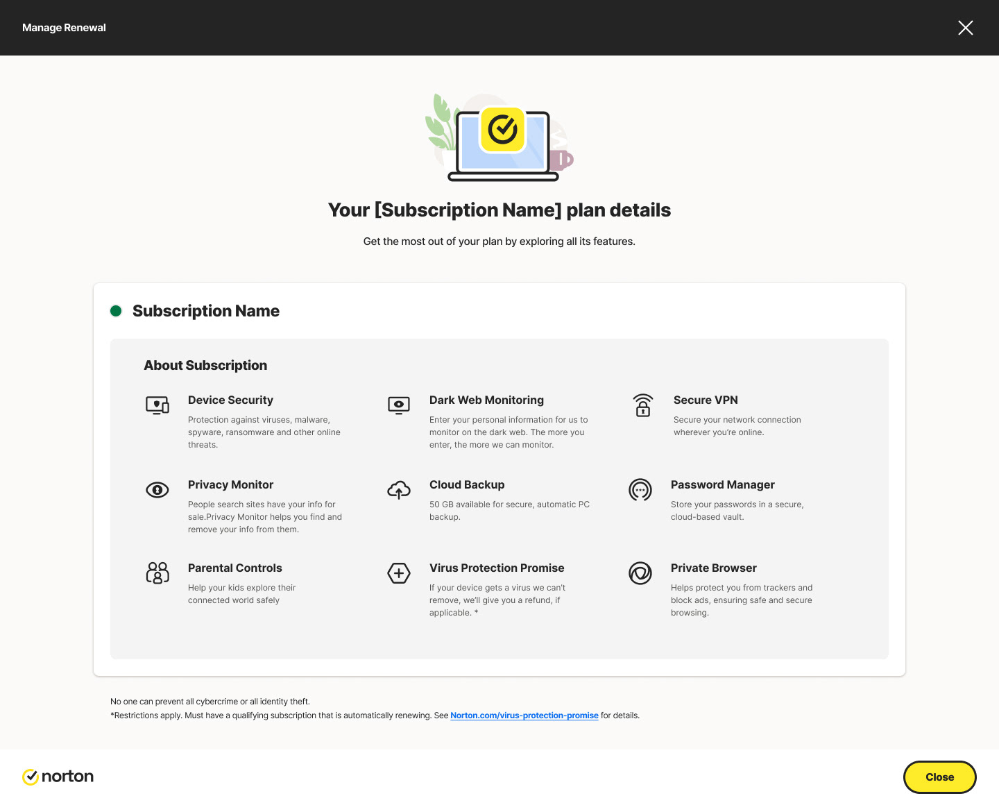
Existing Design
Through moderated user-testing sessions, I identified key issues:
- “Do I have protection right now?”
- “Where do I manage my devices?”
A visual status indicator
A list of benefits/features included
Direct access to high-frequency actions
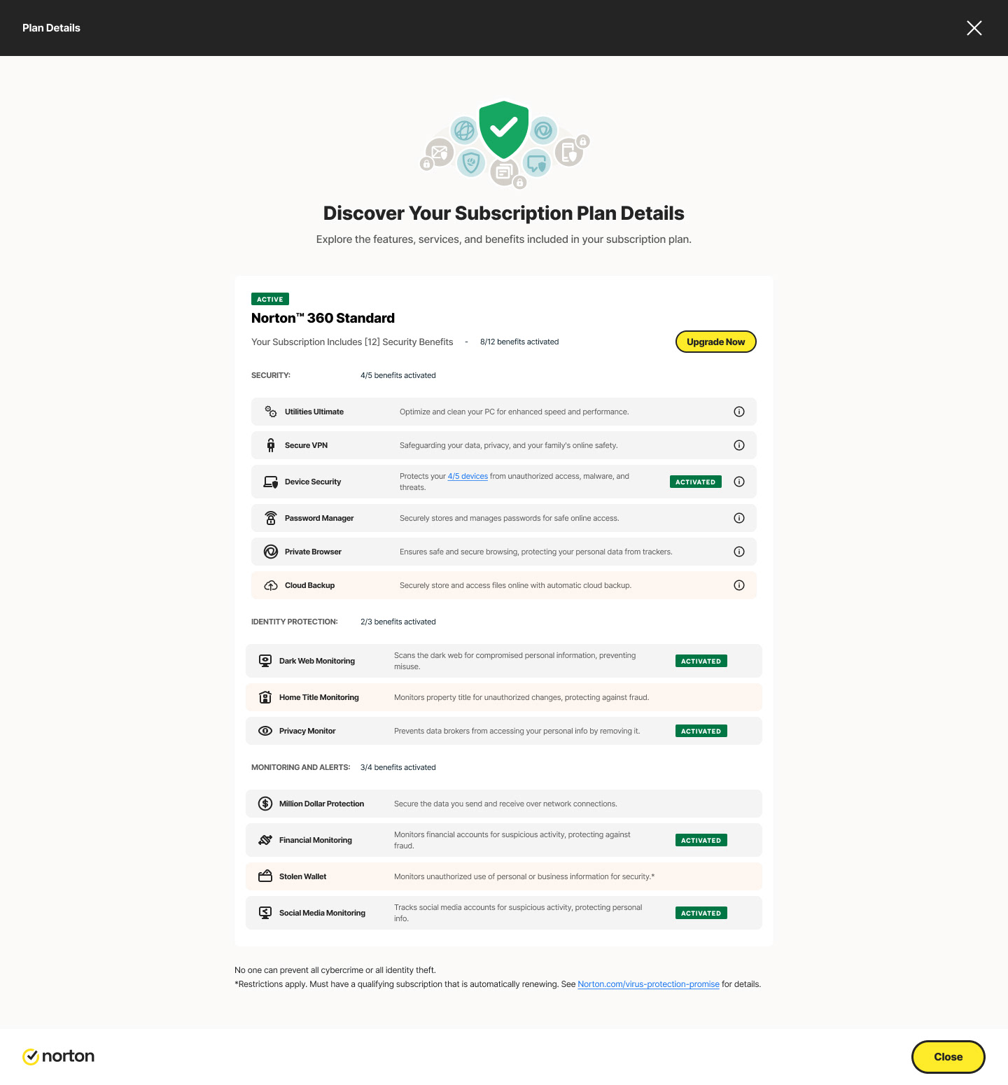
I revisited the My Subscriptions page to expand it beyond the original short description and basic activation status. The redesigned version now clearly communicates what the subscription includes, shows whether it is activated or not, and displays the total number of products, features, and services available within the plan. It also highlights how many of those features are currently activated. In addition, I introduced an upsell section with a prominent “Upgrade Now” option to encourage users to explore higher-tier plans.
Round-table discussions helped prioritize:
- Improving information hierarchy
- Reducing cognitive load
- Presenting benefits in a digestible format
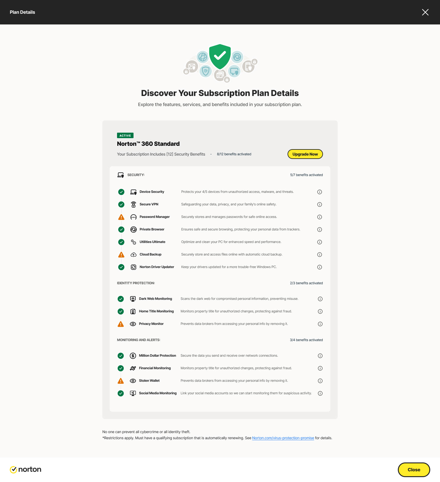
In this version of the My Subscriptions page, I streamlined the layout by reducing excess space and organizing the plan features into clear, nested categories. Instead of repeating activation statuses, I introduced visual indicators to make the page cleaner and more intuitive. I also surfaced the total number of benefits and highlighted how many were currently activated, giving users a quick understanding of their subscription value. Additionally, I added an upsell section with an “Upgrade Now” option to drive conversion opportunities. Overall, this iteration enhances clarity, usability, and feature discoverability.
User testing process and results can be shared upon request.
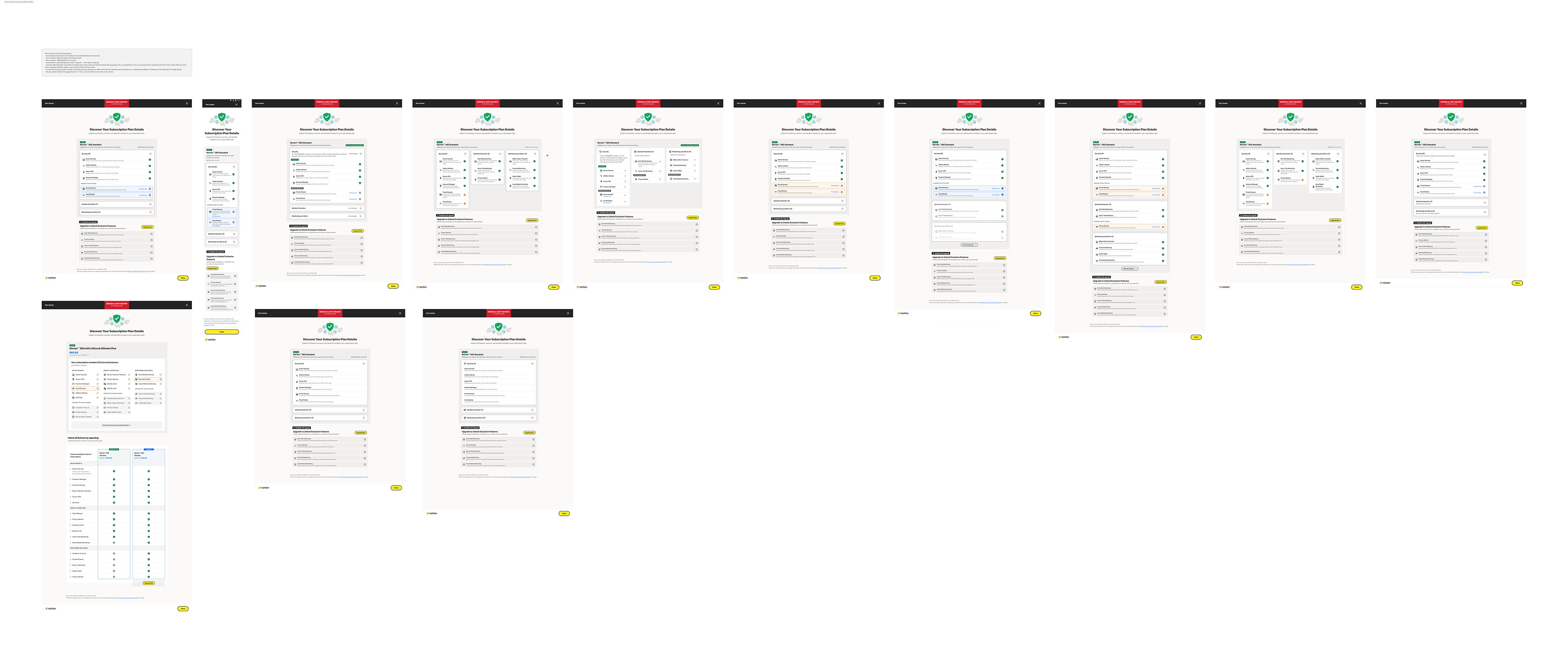
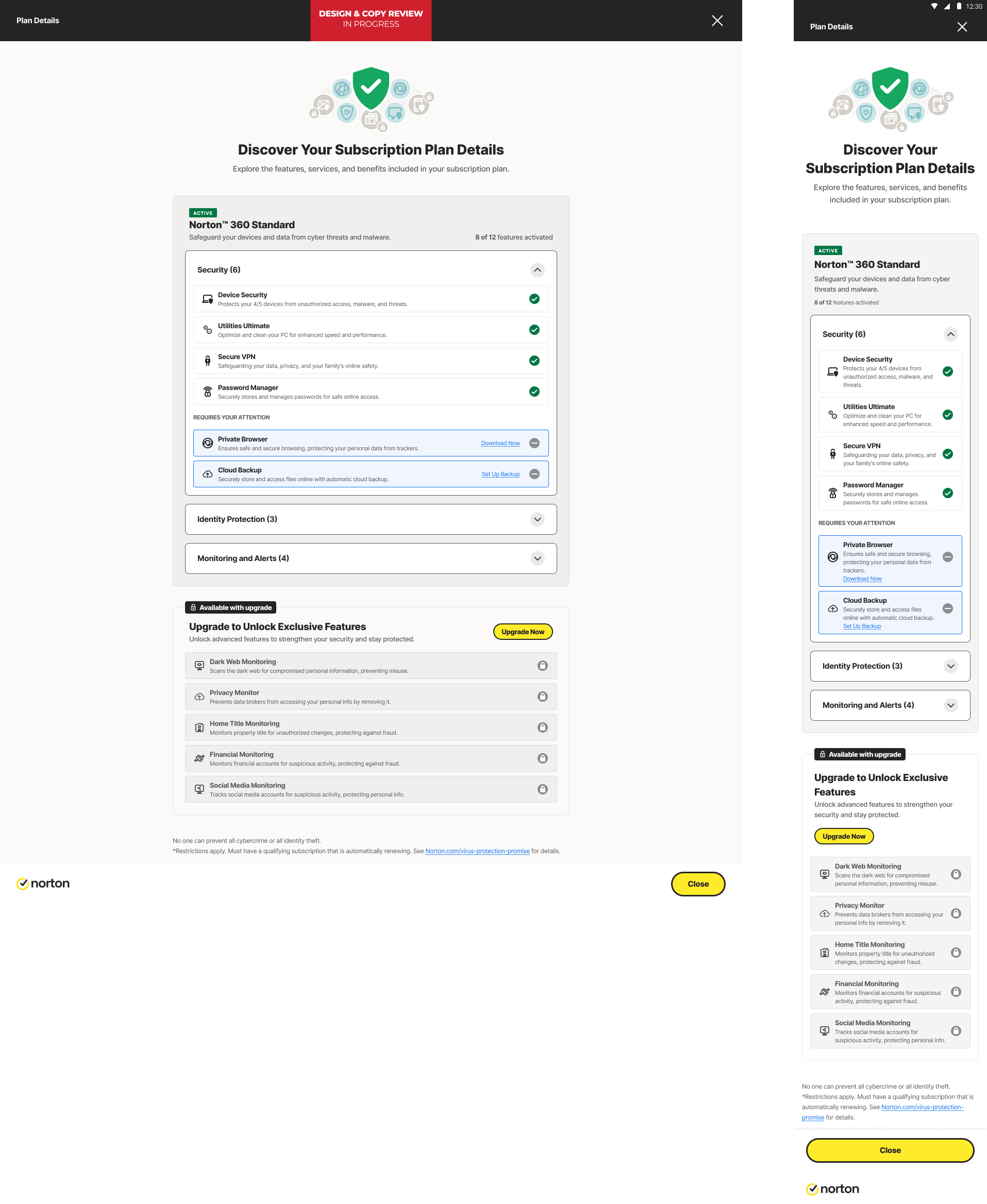
Evolving stages of My Subscriptions page based on the brainstorming, and research key findings.