OKR:
Redesigning the Enrollment Experience to Improve Completion & Retention
Redesigning the Enrollment Experience to Improve Completion & Retention
Overview:
LifeLock is a high-value identity and credit-protection product within the Norton ecosystem. While the product itself delivers strong protection, its enrollment experience had become a major barrier to adoption. Users were dropping off at scale before activation, which directly impacted retention, upsell, and lifetime value.
LifeLock is a high-value identity and credit-protection product within the Norton ecosystem. While the product itself delivers strong protection, its enrollment experience had become a major barrier to adoption. Users were dropping off at scale before activation, which directly impacted retention, upsell, and lifetime value.
The goal of this project was to redesign the enrollment and onboarding experience in a way that balanced user needs, product activation, and business outcomes, while operating within strict system and platform constraints.
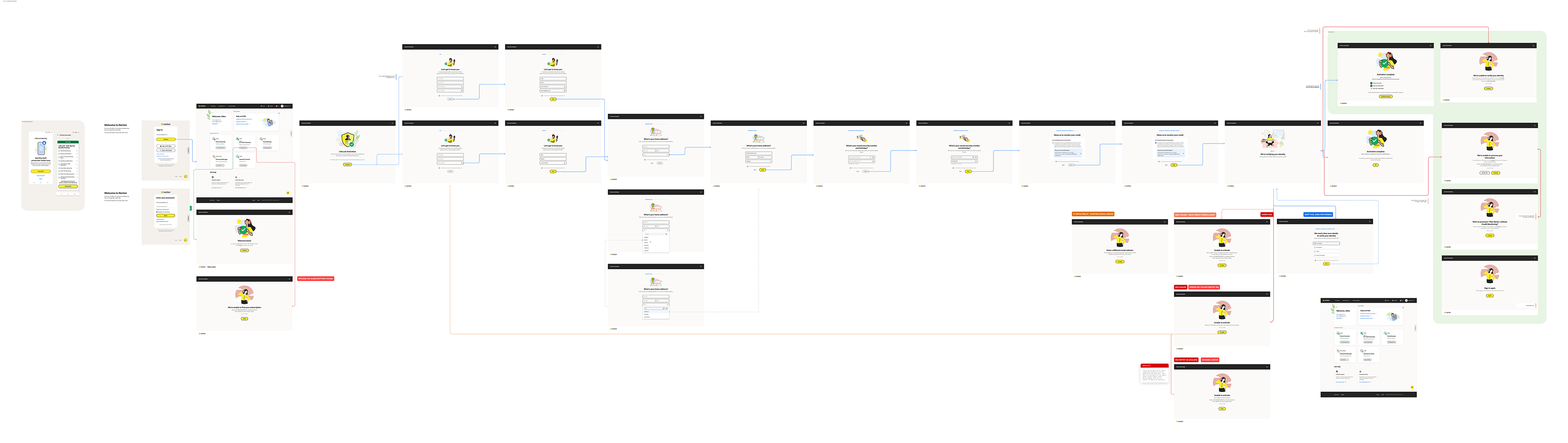
Existing design of LifeLock - Click to view, then zoom in and scroll to see actual size and screens.
Problem
The existing enrollment flow was overly lengthy and highly illustrative, which increased cognitive load instead of providing clarity. Users encountered multiple error scenarios that were difficult to understand, such as hard and soft failures, identity verification errors, and system-driven validations.
These errors did not clearly explain what the actual problem was or what the user needed to do next. In many cases, users were unsure whether they could proceed or how close they were to completion. Due to these issues, nearly 40% of users failed to complete the enrollment process.
Beyond drop-offs, users also lacked awareness of the product’s value. They did not fully understand why sensitive information was required, what benefits they would receive after completion, or how the product would protect them long term. This confusion contributed to users downgrading to lower-tier plans or abandoning premium features entirely.
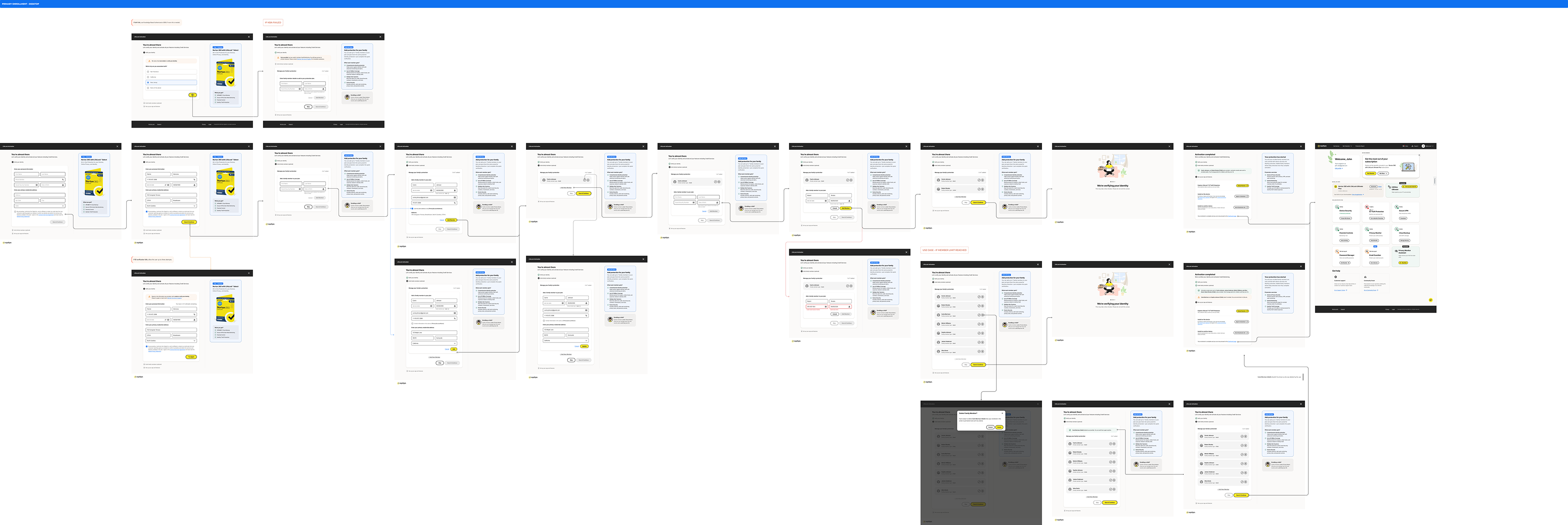
Proposed design of LifeLock - Click to view, then zoom in and scroll to see actual size and screens.
Business Goal
The redesign was driven by a key OKR focused on improving enrollment completion and retaining high-value users. By simplifying the flow and improving clarity, the goal was to reduce revenue loss caused by abandonment and increase adoption of premium services.
Challenges
The enrollment experience was not a single flow but a collection of interconnected journeys, including pre-purchase enrollment, post-purchase enrollment, secondary enrollment, secondary onboarding, and credit service activation.
Additionally, iOS and Android platforms could only support primary enrollment. Any further enrollment steps required redirecting users to the web. The challenge was to design a seamless experience that aligned with the broader Norton ecosystem without breaking system or platform constraints.
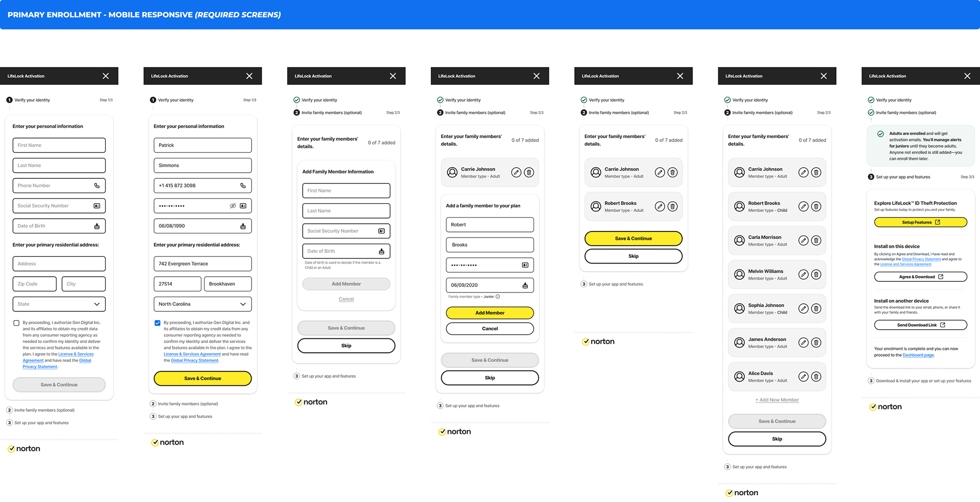
Proposed mobile design of LifeLock - Click to view, then zoom in and scroll to see actual size and screens.
Design Approach
I approached the redesign by focusing on reducing cognitive load and increasing transparency. The goal was to help users understand what information was required, why it was needed, and how far they were from completion.
I reorganized the form structure by grouping related input fields and reducing unnecessary system constraints. Instead of forcing users to complete the entire flow at once, data was saved progressively from one page to the next, reducing anxiety around data loss.
Improving Flow Visibility with a Wizard
The existing design relied on a progress bar that could not accurately represent the number of steps due to frequent validation and error states. Users had no clear sense of how much effort remained.
To solve this, I replaced the progress bar with a wizard-based stepper aligned with the design system. This allowed users to see all steps upfront, understand what information they would be asked to provide, and mentally prepare for completion. Since error handling was redesigned at the field level, the wizard could now reliably reflect progress without breaking the experience.
Clear and Actionable Error Handling
Previously, errors appeared at a step level and were often technical in nature. This made it difficult for users to identify where the issue occurred or how to resolve it.
In the redesigned flow, errors are shown at the field level with clear, actionable messaging. Users can immediately see what went wrong and what needs to be corrected, which significantly reduces frustration and repeated failures.
Communicating Product Value
One of the biggest gaps in the original flow was the absence of product context. Users were asked to provide sensitive information without understanding the benefits behind it.
To address this, I introduced a contextual panel that explains what the user is enrolling in, why each step matters, and what protection or value they gain after completion. This helped users better understand the product’s potential, increased trust, and reduced downgrades caused by lack of awareness.
Optimizing Family Enrollment
Family enrollment was previously complex and overwhelming, which discouraged users from completing the flow. I redesigned this step to be optional and simplified the interaction so users could easily skip it if they chose to.
The experience of adding family members was also streamlined, making it faster and more intuitive for users who wanted to take advantage of the feature.
Reducing Redundancy for Pre-Enrolled Users
In the existing experience, pre-enrolled users were required to re-enter information due to system limitations. In the redesigned flow, previously captured data is reused wherever possible, eliminating redundant steps and improving efficiency.
Cross-Platform Consistency
Because mobile platforms could not support the full enrollment experience, I designed a seamless transition to the web for secondary enrollments. The experience was visually and functionally aligned with the Norton ecosystem, ensuring continuity without increasing friction.
Outcome
The redesigned enrollment flow significantly reduced drop-offs and improved user confidence throughout the journey. Users gained a clearer understanding of the steps involved, the value of the product, and the benefits of completing enrollment. This resulted in improved retention, increased adoption of premium features, and stronger alignment with business objectives.
Key Takeaways
This project reinforced the importance of clarity in complex flows. Users are more willing to complete long processes when they understand the value, see progress clearly, and receive actionable guidance when something goes wrong. Thoughtful error handling and optional complexity can dramatically improve both user experience and business outcomes.