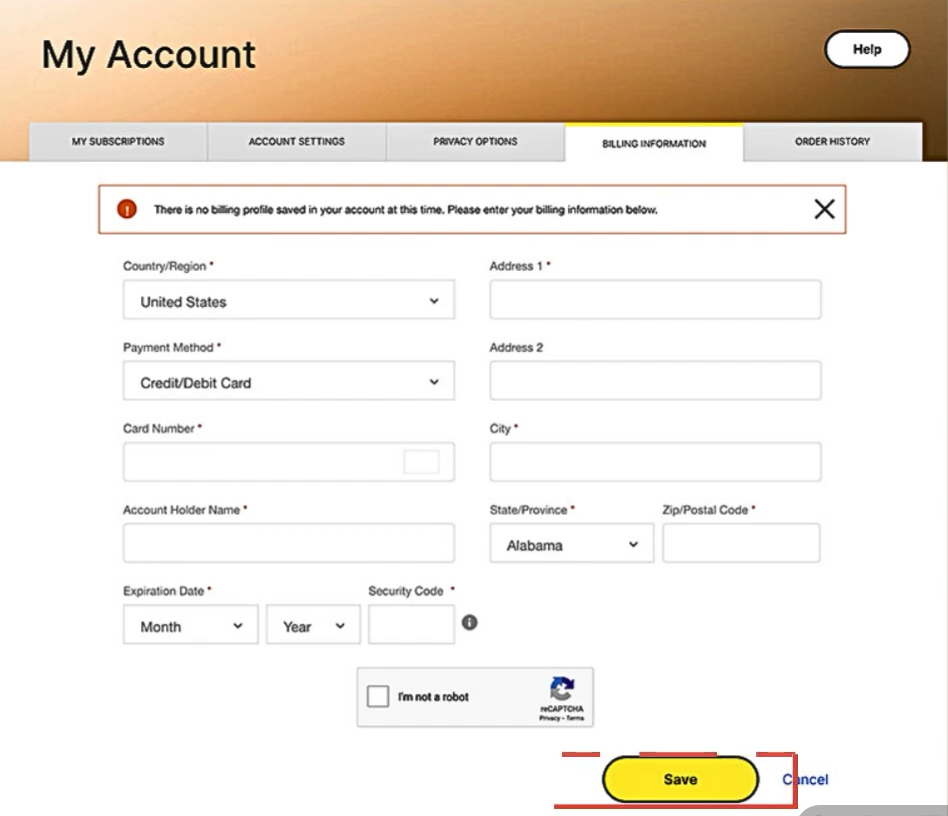
Problem: Too Many Inputs Caused Drop-Off
In the old pricing screen, users were shown too many input fields at once. Card details, address fields, security inputs, and secondary fields were all mixed together in a long, crowded form. There was no clear order, and users had to scan the entire page just to understand what was required.
This created high cognitive load. Faced with so many fields, many users chose to skip or abandon the page instead of finishing it.
Impact on Retention and Revenue
When users did not enter their billing details, automatic renewal could not be enabled. That meant their protection ended after the current period, even though they still needed the service.
This created two problems at once:
- Users lost ongoing protection
- Recurring
- Single difficult form was quietly breaking long-term retention.
- Users lost ongoing protection
- Recurring
- Single difficult form was quietly breaking long-term retention.
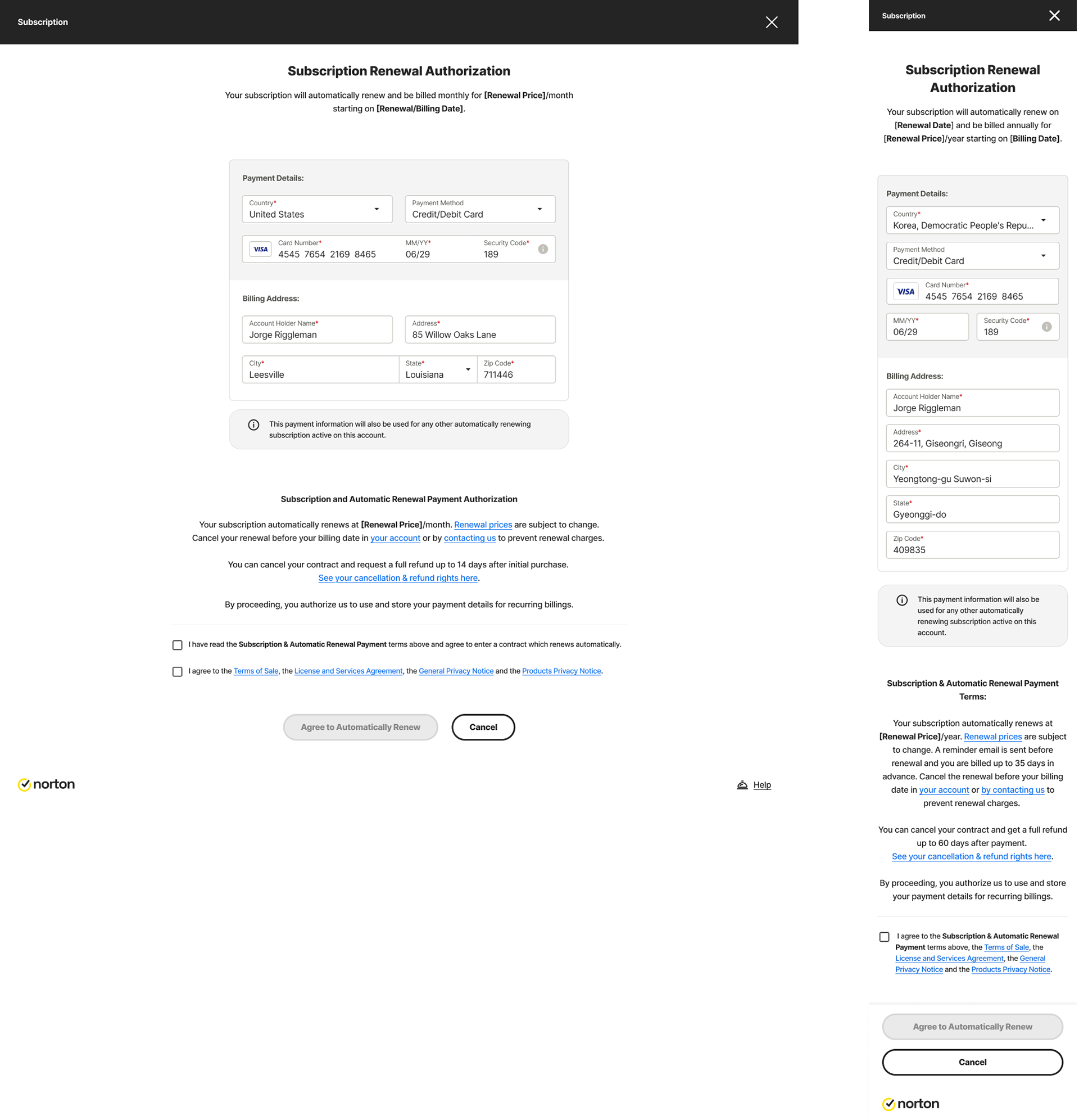
What Changed in the New Design
The new pricing page was designed to reduce effort and make the task feel manageable.
First, unnecessary and low-value input fields were removed. Users now see only what is truly required to complete billing. This shortens the form and makes the task feel lighter.
First, unnecessary and low-value input fields were removed. Users now see only what is truly required to complete billing. This shortens the form and makes the task feel lighter.
Second, the remaining fields were grouped and placed in a clear order:
- Payment information comes first
- Billing address comes next
- Billing address comes next
This matches how users naturally think and makes the page easier to move through.
Using Color and Layout to Reduce Cognitive Load
Using Color and Layout to Reduce Cognitive Load
In the new design, payment details and billing address are visually separated using different background colors and spacing. This allows users to clearly see where one section ends and the next begins.
Instead of feeling like one long form, the page now feels like two small, simple steps. This reduces mental effort and helps users stay focused.
Design System Inputs Build Trust
All fields now use consistent design system input components. Spacing, labels, focus states, and error handling are uniform across the page.
This creates a clean, stable, and professional look. When users see well-designed inputs, they feel more confident entering sensitive information like card details.
Result for Users, Product, and Business
Because there are fewer fields, clearer grouping, and a cleaner layout, users are more likely to complete the billing step.
This leads to:
- More users enabling automatic renewal
- Fewer people losing protection by mistake
- Higher long-term retention and revenue
A better input experience turned a major drop-off point into a reliable conversion step.
- More users enabling automatic renewal
- Fewer people losing protection by mistake
- Higher long-term retention and revenue
A better input experience turned a major drop-off point into a reliable conversion step.