What is Exotel?
Exotel is the "Operating System" for business communication. It replaced the old, hardware-heavy EPABX (Private Branch Exchange) systems—those bulky boxes in office server rooms—with a flexible Cloud Telephony platform.
Exotel is the "Operating System" for business communication. It replaced the old, hardware-heavy EPABX (Private Branch Exchange) systems—those bulky boxes in office server rooms—with a flexible Cloud Telephony platform.
How it powers Big Tech (India level):
Number Masking (e.g. Uber/Ola): When a driver calls a rider, Exotel bridges the call using a virtual number, keeping personal phone numbers private.
Bulk SMS & OTPs: Automated triggers for delivery updates and login codes.
Call Forwarding: Intelligently routing business calls to thousands of remote agents' mobile phones simultaneously.
2. The Challenge:
The legacy Exotel dashboard (Screens 1 & 2) was highly functional but visually overwhelming. Business managers struggled with:
The legacy Exotel dashboard (Screens 1 & 2) was highly functional but visually overwhelming. Business managers struggled with:
High Cognitive Load: Small text and dense charts made "at-a-glance" monitoring difficult.
Disjointed "Lego" Builder: The original drag-and-drop system felt like isolated blocks rather than a cohesive journey.
Visual Fatigue: A lack of clear hierarchy and modern UI patterns made long-term monitoring taxing for support leads.
3. The Solution: A Modular Approach:
I redesigned the experience using Bootstrap-inspired design principles to create a scalable, modular system.
I redesigned the experience using Bootstrap-inspired design principles to create a scalable, modular system.
Key Improvements:
Clearer Information Architecture: Grouped analytics into high-impact cards with 24-hour trend indicators.
Linear Flow Logic: Changed the flow builder from "disconnected blocks" to a "guided path" (1. Start → 2. Greet → 3. Connect).
Predictive Prototyping: Used ChatGPT to define the underlying logic for node connections, ensuring the prototype simulated real-world API behaviors (Success/Failure paths).
4. Visual Transformation (Before (screens added below) vs. After)
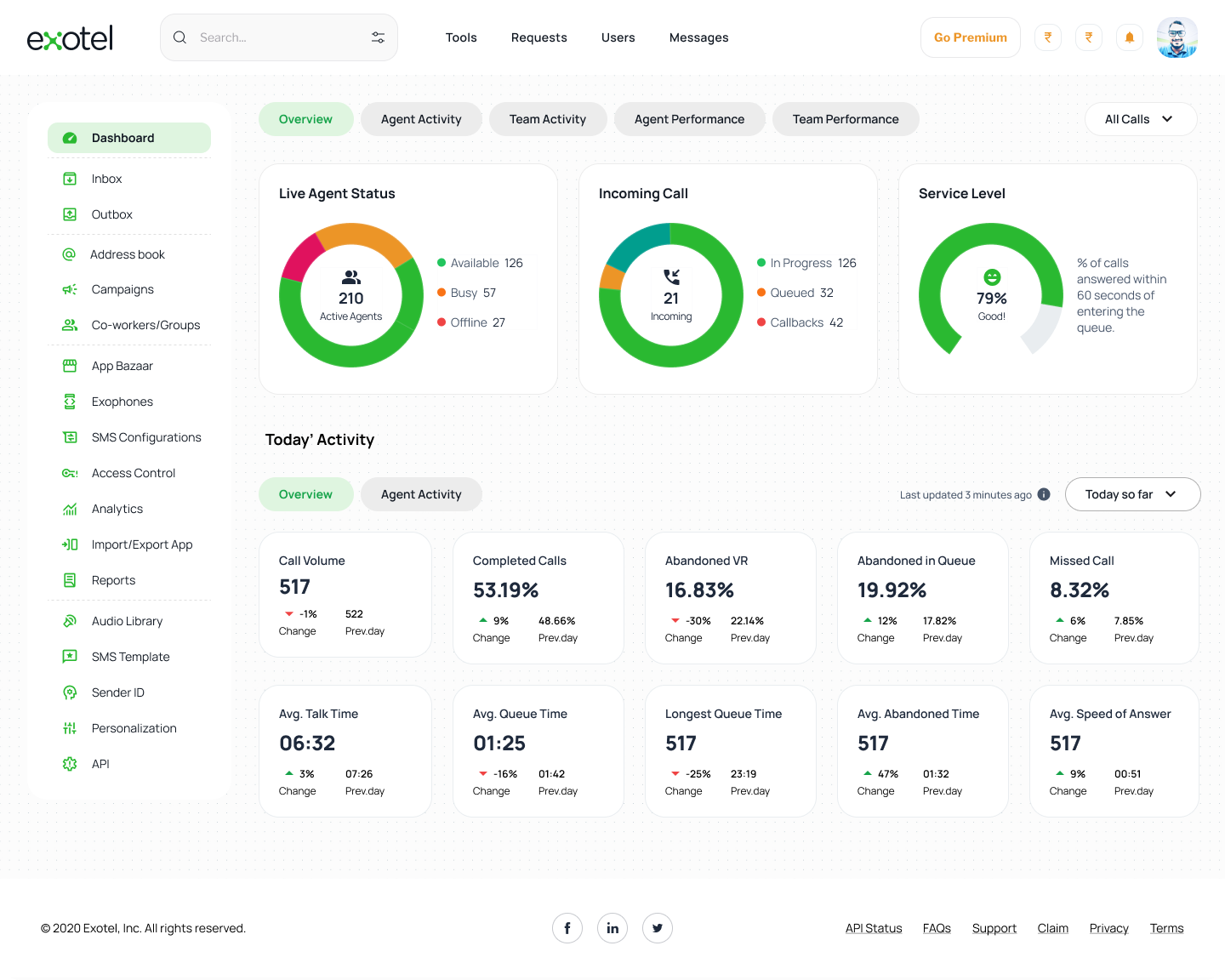
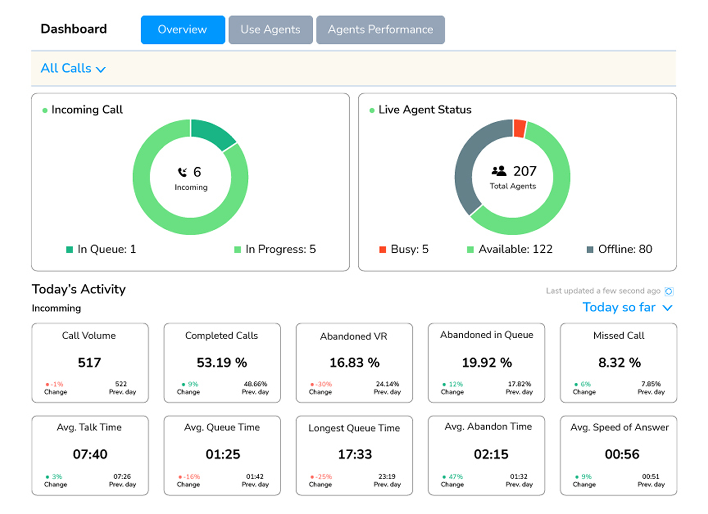
The Analytics Hub (Dashboad): (1st screen)
Old: Information was presented in simple, low-contrast boxes.
New: Designed a Live Agent Status ring and Today’s Activity grid. Each KPI (like "Abandoned in Queue") now features a color-coded "Change %" relative to the previous day, allowing managers to spot issues in seconds.
New: Designed a Live Agent Status ring and Today’s Activity grid. Each KPI (like "Abandoned in Queue") now features a color-coded "Change %" relative to the previous day, allowing managers to spot issues in seconds.
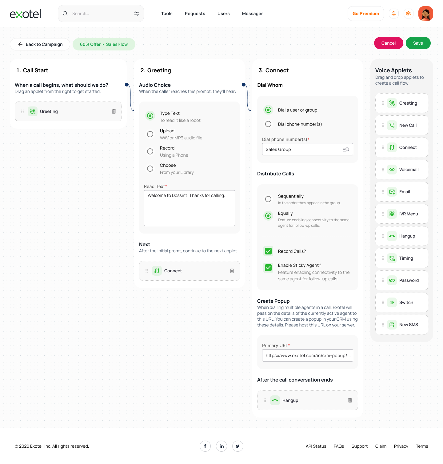
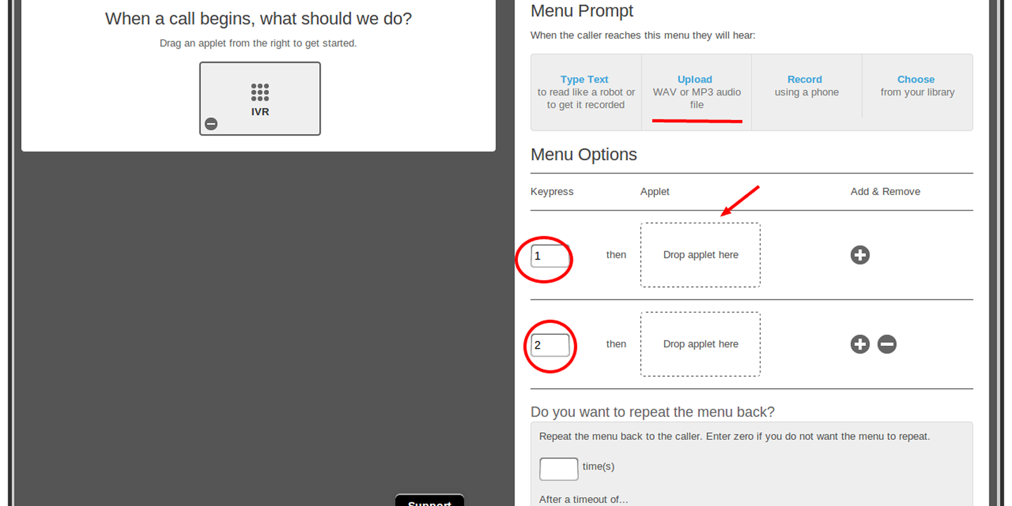
The Flow Builder: (2nd screen)
Old: Used a "Lego-block" style where connections were often ambiguous.
New: Implemented a Vertical Node System. When a user clicks an applet, it expands to show context-specific options (e.g., Audio Choice: Type Text vs. Upload). The connection to the next node is visually reinforced by a continuous "thread" line.
New: Implemented a Vertical Node System. When a user clicks an applet, it expands to show context-specific options (e.g., Audio Choice: Type Text vs. Upload). The connection to the next node is visually reinforced by a continuous "thread" line.
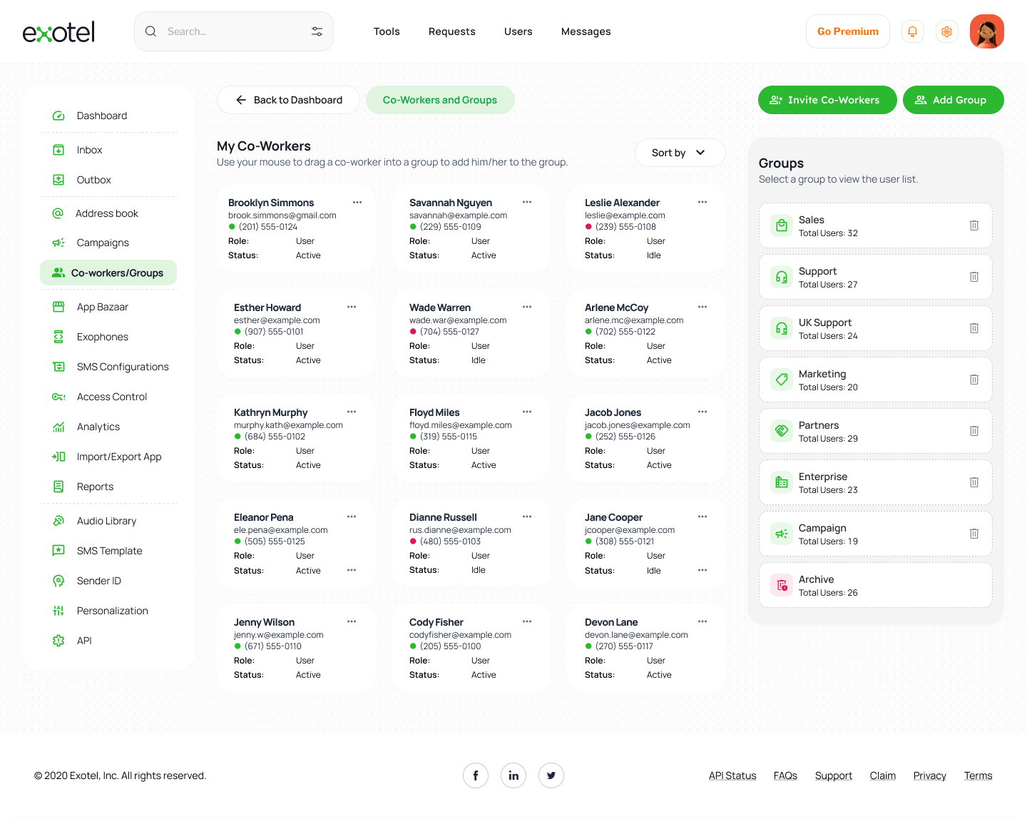
Team Management (Screen 3)
New: Replaced text-heavy lists with a Card-based Directory. Each agent's status (Active/Idle) is instantly recognizable via status pips, and a right-hand "Groups" panel allows for rapid drag-and-drop team organization.
5. Technical Implementation:
To make the redesign professional and "developer-ready," I focused on:
Modular Sidebars: A consistent navigation system that stays out of the way during creative tasks (building flows) but is instantly accessible.
State Management: Designed specific UI states for "Busy," "Available," and "Offline" agents to assist real-time monitoring.
Bootstrap Grid: Ensuring all elements align to a standard grid for easier handoff to front-end developers.
6. The Impact:
The result is a dashboard that transforms a complex technical tool into an intuitive business asset.
The result is a dashboard that transforms a complex technical tool into an intuitive business asset.
Reduces Training Time: New managers can understand the call flow without a manual.
Faster Troubleshooting: Visual trends allow for proactive fixes to high "Missed Call" rates.
Scalability: The modular card system allows for new features (like AI-Voicebots) to be added without cluttering the UI.
Faster Troubleshooting: Visual trends allow for proactive fixes to high "Missed Call" rates.
Scalability: The modular card system allows for new features (like AI-Voicebots) to be added without cluttering the UI.
"The goal wasn't just to make Exotel look better, but to make the complex logic of cloud telephony feel as simple as drawing a line on a map."
Old Designs:
This project is a conceptual redesign of Exotel’s call-flow dashboard, created entirely for my personal portfolio. Exotel is known for its drag-and-drop flow builder that allows businesses to create dynamic, fully customizable call-routing automation—helping teams send calls to the right agents or departments effortlessly.
For this concept project, I explored how the dashboard experience could be made more intuitive, visually clean, and easier to use, while maintaining the essence of Exotel’s platform.
I designed the entire concept UI in Figma, focusing on improved layout structure, visual hierarchy, and a more streamlined drag-and-drop flow builder. My goal was to simplify the user journey by creating clearer components, better spacing, and a more predictable interaction pattern.
Using Bootstrap-inspired design principles, I created reusable components, modular panels, a simplified node library, and a clean sidebar system. To prototype complex interactions and states—such as connecting nodes, viewing details, and managing flow logic—I used ChatGPT to help generate structured UI patterns and component logic, which allowed me to simulate realistic interactions for the concept.
The result is a polished, professional conceptual dashboard that reimagines how Exotel’s flow builder could look and function with modern UX practices.